Over the past few years, Microsoft® has introduced updates to the user interface (UI) for its Office programs. Microsoft® Office 2013 is all about being touch-screen friendly, and Microsoft® Office 2007 brought the Ribbon interface. The Microsoft® Ribbon was designed to be easier to use than the nested drop-down menus of yore. These days, it’s what we’re used to seeing when working with their tools — and we’ve come to appreciate the ease-of-use, guidance, and clear workflow overview it provides. If you were at the COMSOL Conference 2013 or have been keeping up with social media, you may have heard about the upcoming UI change to COMSOL Multiphysics® as well. Here’s the philosophy behind introducing a ribbon to the COMSOL® interface for version 4.4.
The Ribbon Displays Commands When You Need Them
The philosophy behind the ribbon is simple: grouping commands and showing them when you need them makes it easier to use the tools and get your work done quicker. The commands are grouped in ribbon tabs and in COMSOL® these tabs are ordered according to the main workflow from left to right. The commands within a ribbon tab follow that order as well. Below you will see screenshots of the new UI, as shown at the COMSOL Conference 2013.

The ribbon within COMSOL Multiphysics® 4.4, showing the Home tab.
Just as in previous versions, you can also access commands by right-clicking in the Model Tree — the two methods complement each other. On one hand, the ribbon gives a great overview of the different commands you can use, but on the other hand, the Model Tree gives a great overview of the model data structure. In short, the ribbon represents “what will come next” and the Model Tree is used for seeing “what is already there”.
The Home tab you see above contains buttons for the most common operations for making changes to a model and running simulations. For instance, if you want to change a model parameter that controls a parametrized geometry, inspect the material properties and physics, build the mesh, execute a study, or visualize the simulation results, you do that from within the Home tab by using the commands from left to right.
In essence, the ribbon provides three types of groupings. The first is a group ofstandardtabs that are always displayed along the top of the program you’re using. Thestandardtabs pertain to each of the main steps in the modeling process and are ordered according to the main workflow. In each of these tabs, you can get an overview of all functionality available for the specific modeling step. The Geometry tab, for example, contains all functionality for importing and drawing geometries.

The Geometry tab in the new user interface of COMSOL Multiphysics® 4.4.
The second type is acontextualtab that only appears when you are working with a particular object within the COMSOL Desktop® interface. An example of this is a plot group tab that appears temporarily when you add the corresponding plot group or select the corresponding node in the Model Tree.

A Temperature plot tab, which is an example of a 3D Plot Group contextual tab.
The third kind of logical grouping is referred to as amodaltab, which shows up when you are completing a very specific task and do not have any use for the core tabs on the ribbon. The Work Plane tab is an example of amodaltab. When working with Work Planes, other tabs are not shown since they cannot operate on work planes. For instance, you cannot create meshes in work planes so you would not need to access the core Mesh tab (you can of course create meshes on the 3D faces created by work planes).
Why the UI change?
With COMSOL® 4.4, we are introducing the new UI for improved usability and guidance, and for giving a complete overview of all the available commands in a structured way. These are mostly the same reasons as what led Microsoft to incorporate a ribbon into their programs back in 2007. As theyexplained it here, each tab is associated with a specific action and contains a number of commands to go along with that action. Furthermore, each tab is labeled with the intention of making it easier for the user to determine which one to click on. For contrast, you may recall the menus of pre-2007 Office, with their separated but unlabeled command groupings.
From a design point of view, ribbon interfaces are a lot more visually oriented than their drop-down menu and toolbar counterparts. They may take up more horizontal space, but they also lay everything out in the open in a structured and well-marked fashion to save you time when looking for what commands to choose. (You can read more about thenature of ribbons here.) While the ribbon design was initially a very radical change, it has since then been adopted as the standard practice. We thought it was time the COMSOL Desktop® interface reflected this, too.A note for Mac and Linux users: on these platforms, the ribbon is replaced by toolbars providing close to identical functionality.
What the Ribbon Means for COMSOL Users
The ribbon in the new User Interface in Windows® to be introduced with COMSOL® version 4.4 will give you a clearer picture of the workflow in the modeling and simulation process. It will also give you an improved overview of the functionality that is available for each of the steps involved in the process.
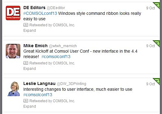
Here are some tweets from when we announced the new UI at the COMSOL Conference in Boston:

What doyouthink of the new user interface? Talk to us via the comments section below.
Microsoft is either a registered trademark or a trademark of Microsoft Corporation in the United States and/or other countries.


Comments (2)
Pavel Dergachev
November 1, 2013it’s perfectly
Ivar Kjelberg
November 2, 2013Well, I’m still not convinced about the MS Ribbon, so for me this is not your 4.4 highlight (as it introduces mainly more mouse travel, and eye refocus).
What I appreciate in the 4.4 pre-release I got at last conference, is a couple of new features I have found in the physics, the single click selections, and in the model/component tree, the cleaner way to separate each Main Physics and the Multi-Physics couplings
I’m certainly continuing to have fun COMSOLing
Ivar